

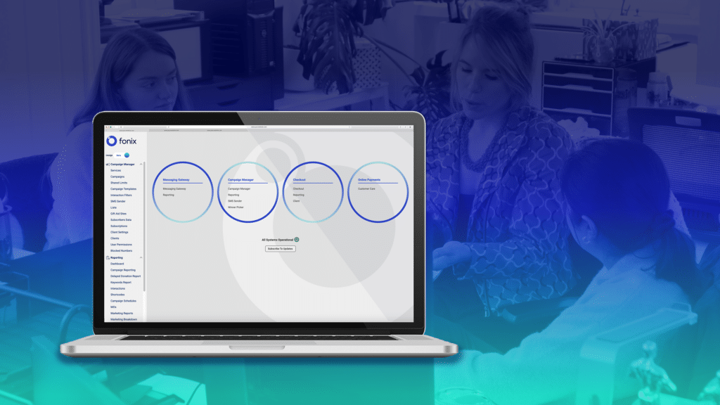
We’re excited to share a fresh new look for Fonix’s Campaign Manager! Our recent UX/UI design refresh is all about enhancing your experience, streamlining navigation and making our platform as intuitive as possible. Here’s a closer look at what’s changed:
A smarter, simpler user experience
One of the key goals of this redesign was to improve usability across the board. We’ve simplified navigation and made the interface cleaner, allowing you to accomplish tasks faster and with fewer clicks. Whether you’re setting up a new campaign or building a schedule of sends, everything should now feel smoother and more streamlined. We applied the principle of Flexibility (a key UX/UI concept) in the new design, allowing users to correct mistakes or, if they change their minds, easily go back, cancel, close, confirm, or undo actions.
Enhanced accessibility & intuitive interface
Accessibility is at the heart of our design refresh and we wanted the platform to work for any user for any scenario. We’ve reimagined the interface with improved clarity and visual hierarchy, making it easier for everyone to navigate and use. The new design system, complete with updated iconography and a modernised look offers a visually appealing experience. As part of the design process, we rigorously tested the contrast ratio to ensure it meets accessibility standards and is inclusive for users with various forms of colour blindness.
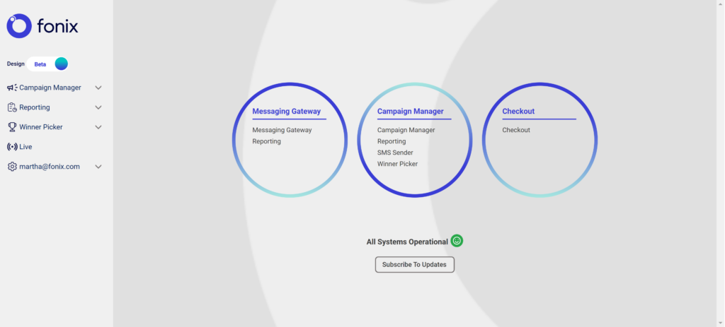
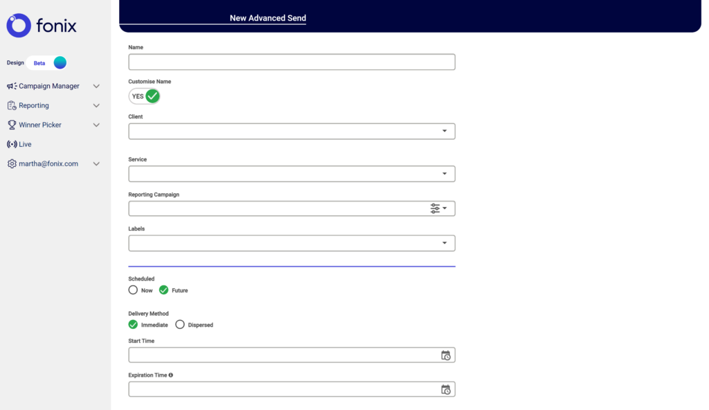
New design system: a cohesive look and feel
We’ve introduced a brand-new design system, standardising components like buttons, icons, and forms to ensure consistency across the platform. Now, you’ll find a unified design language that makes using the Campaign Manager platform smarter and visually consistent.
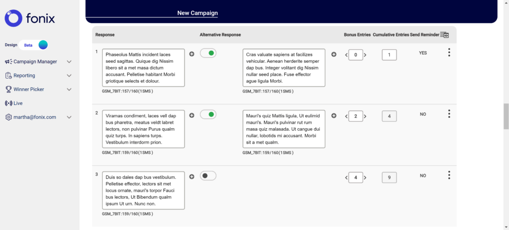
Feature improvements: less clicking, more doing
Navigating long forms, sorting through userdata, and managing multiple campaigns just got a lot easier. Here are some of the notable feature updates:
- Summary table on campaign set-up pages: Quickly see all the essential details of your campaign at a glance, without endless scrolling or navigating through multiple tabs.
- Multi-select on index pages: Managing multiple items and bulk actions at once is now a breeze, thanks to the new multi-select feature.
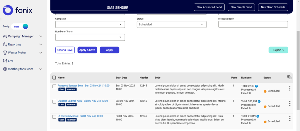
- Improvements to filters: Refine your searches with advanced filtering options on campaigns, making it easier than ever to find exactly what you’re looking for.
- Enhanced UI with clearer CTAs and form design: Elevate your experience with new button styles and better-organised forms, making the interface more visually appealing and less daunting to navigate or complete.
User feedback-driven design
This redesign isn’t just about aesthetics; it’s rooted in user-centricity and based on feedback from you – our users. We’ve taken your insights to heart, focusing on the pain points you’ve highlighted and reworking our platform to better meet your needs. The end result is a more user-friendly, intuitive tool that reflects your input and our commitment to continuous improvement.
Modernisation for visual appeal
The old interface was functional but felt outdated and unloved. We’ve brought the platform in line with modern UI trends and principles to create a more visually engaging experience. Expect a clean, sleek look that’s not only pleasant to use but also aligns with the best practices of contemporary design.
Boosted performance & scalability
Behind the scenes, we’ve also reworked our codebase for improved performance and scalability. Page loads are faster, and we’ve rewritten our automated tests to be quicker and more reliable. This means better coverage for our platform and a smoother, bug-free experience for you.
What’s next?
While we’re thrilled with these improvements, we’re not done yet! We’re still hard at work on several key areas of the Campaign Manager platform, including the Campaign Summary page, Reporting pages, and the Winner Picker tool. We’ll also be continually adding new features to the platform such as sticky buttons and table headers. These upcoming updates will add even more value and functionality, so stay tuned for further enhancements.
We’re excited for you to explore the new design and features, and we look forward to hearing your thoughts as we continue to evolve the platform! Drop us an email – product@fonix.com.